Want to win more jobs with less effort?
Grow your business and send quick quotes with our home service software.

Want to see your potential revenue?
See what businesses like yours earn with Housecall Pro in 1 - 2 minutes.
As a service business professional, you know how important advertising can be for your business. And you may think billboards are easy, right? Well, yes and no. There are a few super important guidelines to keep in mind before you start designing your billboard. We’ll walk you through examples of boards that work and ones that fall flat. Learn the “why” behind billboard success, and you’re moments away from advertising out there like the best.
Things Pros need to know before designing billboards
- Size of the billboard (get exact dimensions)
- Location
- Copy should be short and easy to read at a distance
Things Pros must include on billboards
Logo
Billboards are commonly wide, horizontal canvases. Logos can take up a large amount of space; some are tall or oddly shaped. It’s easier if your logo can easily adapt. Consider this when branding your business.
Remember, don’t stretch out any logos. Stretching them distorts them, and warping third-party logos can affect credibility. You can solve this by holding “shift” while clicking to scale.
Attention-grabbing headline
Keep it short and easy to read. Something short and snappy like “Keep your cool this summer” is much better than filling up the entire billboard with a paragraph of text. Remember to make your headline legible, short, and attention-grabbing. Example: “Don’t wait til the last second to get your oven fixed.”
Contact info
You always want to include your phone number and/or website on the billboard but keep in mind that numbers are hard to remember, and you can’t jot it down while driving!
Call to action (CTA)
Let them know what action you want them to take—book today, call us, etc. Think about hierarchy in layout. What do you want to prioritize? It’s a challenge to focus on one thing more than another. Consider having one or two of the options we just talked about be the main focal point. The rest can play a supporting role.
Billboard nice-to-haves (but not required)
Awards
Have a Superpro logo, BBB logo, or local awards you’ve won? Let your customers see the awards you’ve racked up! Don’t be afraid to reach out and ask the providers of the awards if they can give you white/black/monochromatic logos to use.
Your service areas
If you operate in specific cities/counties, list out the local areas your business covers.
Your company slogan
Got a slick saying you’re known for? Add it to the billboard.
Dynamic QR codes
What makes these QR codes “dynamic” is the URL encoded in them redirects to a second URL that can be changed on demand, even after a code is printed. Static QR codes can’t be changed like that. Remember, only passengers can take a snap of it. Hopefully, drivers are driving. We suggest using this QR code generator. It’s free for static codes only, but dynamic codes are available for a subscription.
Billboard tips and tricks for Pros
Billboard design
On the design front, consider readability with typography, sizing, and color contrast. Don’t use more than one or two fonts.

Choose a font that is easy to read. Legibility is the priority. Large text is king. Avoid cursive scripts and long paragraphs like the plague.1 (See our recommended list of Google fonts at the end of the article).
Keep your words short, concise, and eye-catching. No one has time to read a novel when they’re driving a car. Give them high-priority, need to know details.
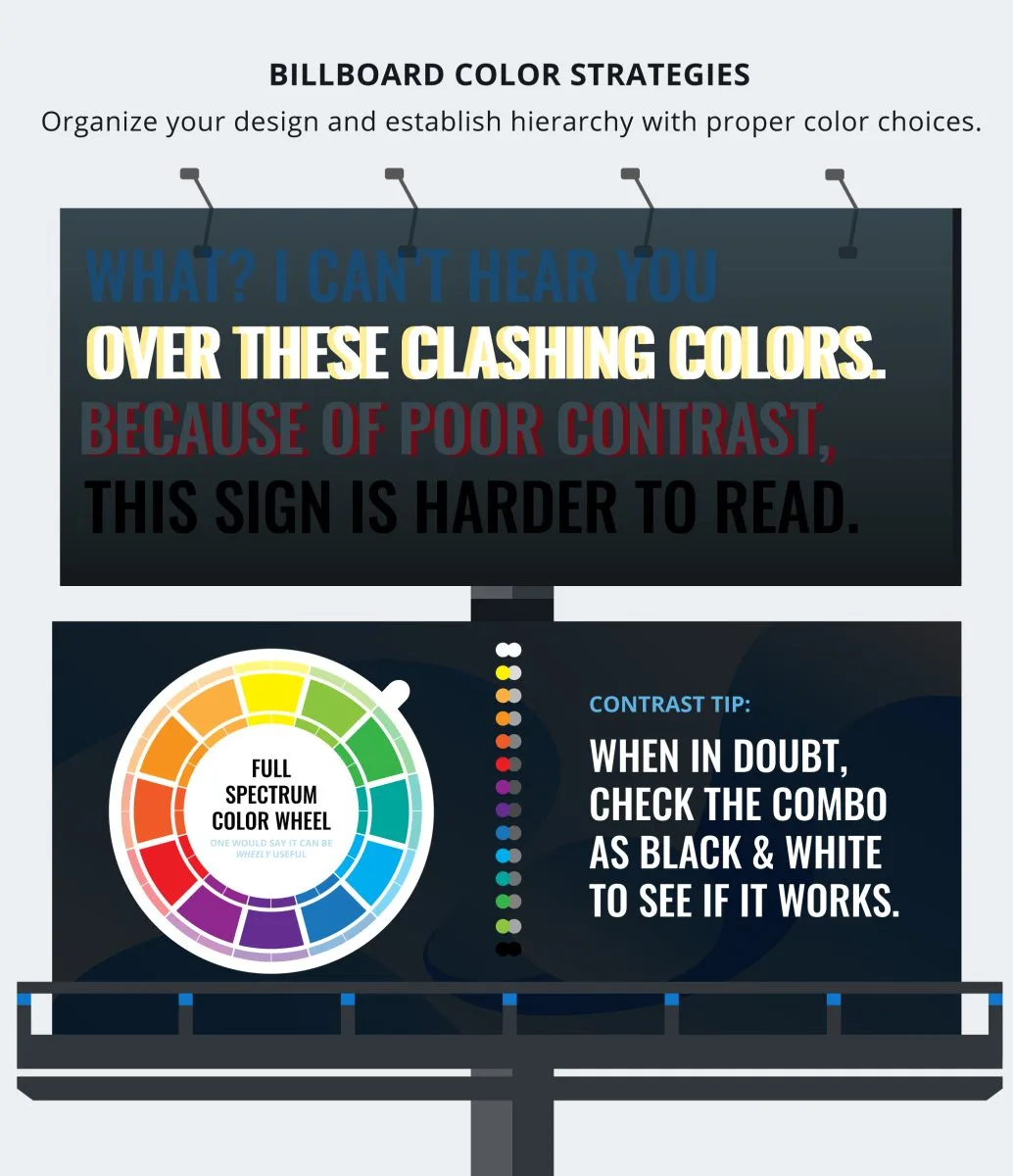
Colors shouldn’t be muddy so that they blend in with each other.
Location of billboard
Where the billboard is might affect the message. A sign on the side of a bus can get nasty easily. A billboard on a busy intersection should be approached differently from a billboard in a quiet town. Think about how the billboard looks at different times of day and make sure it’s well-lit.
Less is more
Don’t overwhelm the billboard with a ton of content in it. Keep it clean! You don’t need to fill every inch with words and images. Keep it simple.
When laying out your design on the blank canvas for the first time, map out an imaginary border around the edges of the billboard. Avoid placing text or logos that go over the edge of the billboard. Remember the old rule to measure twice and cut once. Plan out what the must-haves are and where they go. This is stuff like your logo, contact info, attention-grabbing sentence, and call to action.2
Show. Don’t tell.
Use imagery to support your message. What do you want customers to feel? What’s going to make them pick you in about a four-second glance? Do that. Think like Apple, for instance. They focus more on marketing what their products do for you. Not so much what the products are.3 (Little marketing tip for you there.)
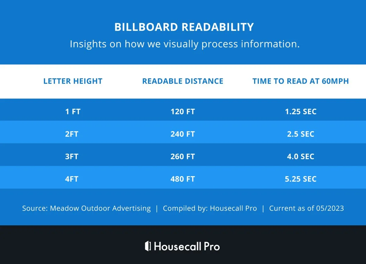
You’ve only got three or four seconds!
They’re driving and hopefully paying attention to the road. They only have a few seconds to read your billboard. Get their attention, but keep it short. The experts say you have a maximum time exposure of 6 seconds.4 And that’s if you’re lucky!
Billboard examples – with pictures
Bad billboard examples
Now here’s the fun part. Let’s walk through some billboards that catch the eye for all the wrong reasons. Some of these you just have to see to believe.
Example 1:
Image source: Wheel House Creative
What’s wrong: There’s way too much info. Where do you even start? The contrast is hard to read and the message is unclear. Butch Wax and the Hollywoods? No idea.
Example 2:
Image source: Wheel House Creative
What’s wrong: The text is too small and there’s too much of it. They’ve aligned their text in three different ways: left-justified, centered, and right-justified. No FieldStone. Just no.
Example 3:

Image source: Wheel House Creative
What’s wrong: The text is too small. The image doesn’t grab your attention. Or even make sense. And it’s creepy. And the design is awful. Only use a QR code if you have to!
Good billboard examples
Some billboards just understand the assignment and knock it out of the park. Here are some of our favorites.
Example 1:

Image source: Wheel House Creative
What’s good: The photo is clever and the message is clear.
What could be improved: The slogan is too small to read, and the color contrast of blue against gray can be hard to see. No one can read the website on the bottom left. You had to look just then! You didn’t even know it was there.
Example 2:
Image source: Twitter
What’s good: The image is a good one, and they kept the messaging short.
What could be improved: The logo and CTA could be slightly larger. But we’re getting closer!
Example 3:

Image source: Duets Blog
What’s good: It has clear, attention-grabbing copy and the hashtag is easy to remember. The logo and website are easy to read.
What could be improved: Across the bottom left, “plumbing | drains | electric | heating | air” can get lost since the font is so condensed.
Example 4:
Image source: Durden
What’s good: It has awesome color contrast, a clear message, and an easy-to-read logo. That yellow pops.
What could be improved: The contact info should be bolder. The URL is a little hard to read.
Example 5:
Image source: Pinterest
What’s good: We’re big fans of Dan Antonelli and his crew at Kickcharge Creative. They’re responsible for this one. It has great hierarchy, clear and legible type, and perfect contrast. The phone number may be overkill, but the website is fairly easy to read.
Good font options for billboards
Here are a few recommended (but not required) fonts in the sans serif family that Pros can use. Whatever font you go with, choose a font that is easy to read. See this recommended list of fonts to use below (info taken from Google fonts).
Roboto
Roboto is a very popular and common font across the board.
- Designer recommended pairs: Medium 500 + Black 900

Open Sans
Open Sans is a Housecall Pro fave. With a neutral and friendly design, it’s also popular.
- Designer recommended pairs: Regular 500 & Bold 700

Montserrat
Montserrat is a go-to for the Conquer team. It has a bold and geometric design.
- Designer recommended pairs: Extra bold 800 & Semibold 600

Oswald
Oswald is another Housecall Pro pick. This tall font also pairs well with Open Sans, best used as bold, and all capital headlines in design.
- Designer recommended pairs: Medium 500 & Light 300

Source Sans Pro
Source Sans Pro font is a common corporate and reliable design.
- Designer recommended pairs: Regular 400 & Bold 700

Raleway
Raleway font is elegant and stylistic.
- Designer recommended pairs: Medium 500 & ExtraBold 800

Hanken Grotesk
Okay, yes, Hanken Grotesk has a weird name, but it’s friendly and distinguishable in any size. It’s a newer font to the game, making its debut back in 2016.
(Designer recommended pairs: Black 900 & Medium 500)

Fredoka
Fredoka is a fun font with rounded ends. It is super playful and friendly if that suits your brand. It made its debut in 2018.
- (Designer recommended pairs: Semibold 600 & Regular 400)

Space Grotesk
Yep—another funky name. Space Grotesk is distinctly modern, monospaced, and optimized to be readable at any size.
- (Designer recommended pairs: Bold 700 & Regular 400)

Archivo
Archivo is designed to perform on both print and digital platforms. It supports 200 languages. Yes. 200! It’s also available in Archivo Narrow & Archivo Black fonts.
- (Designer recommended pairs: Archivo ExtraBold 800 & Archivo Medium 500)

Roboto, Open Sans, Montserrat, Oswald, Source Sans Pro, and Raleway are among the most popular fonts for good reason. They’re reliable, professional, and easy to read.
Hanken Grotesk, Fredoka, Space Grotesk, and Archivo are also easy to read but carry a little more personality if that’s what you’re looking for.
Deep breath! You reached the end.
We know that’s a lot, but you’re now ready to stand out on the highways and freeways. Keep these best practices in mind and go get the word out!

